Competitive Analysis
Preliminary research helped me to determine project requirements. I found that a small percentage (3%) of the people I surveyed had used a food truck finding app, while most (70%) had used food delievery apps such as GrubHub or UberEATS. Three-quarters (75%) of respondents found an easy payment process to be the best part of using their app of choice, while almost as many (64%) complained that food menus were confusing or inaccurate.
Since only three percent of survey respondents had ever used a food truck finding app, I scoured user reviews of existing food truck finding apps for clues as to what was working and what was not.
Would be great if trucks could be sorted by distance. You have to scroll through the entire day to see what’s around and close by. Show trucks by distance from my location.

When the app's information is correct it's great, but a good deal of the time the information is incorrect. Constantly shows trucks as open that aren't, and often doesn't list trucks that are very popular and well known.

Features work great but there is so much more it could do. I would really like to search by location and date; even better would be notifications for which truck will be at my school the next day.

SWOT analysis
I created a SWOT matrix combining data from three of the most popular food truck finding apps. The biggest takeaway from this, in terms of design, was that an intuitive and clear flow was important.
INTERNAL
POSITIVE
NEGATIVE
EXTERNAL
Strengths
Functionality easy to use. Quality well-designed. Experience/Expertise developed through large corporation. Network large database, connects customers nationally. Partnerships event promotions create wide visibility.
Weaknesses
Limited network only available in select cities. Accuracy relies on vendor participation. Design not intuitive. Information not enough vendor detail. Reputation purpose ineffectively communicated due to expansive scope of company’s goals. User focus lack of specific target market.
Opportunities
Customer loyalty well-positioned for growth through positive user reviews. Marketing large corporate backing could create lots of buzz. Growing market positioning as intermediary for events could broaden app’s appeal.
Threats
Timing still in BETA version on Android a year plus later. Focus lack of attention to functionality/design could undermine success. Direction too broad a definition of app’s functionality may confuse users.
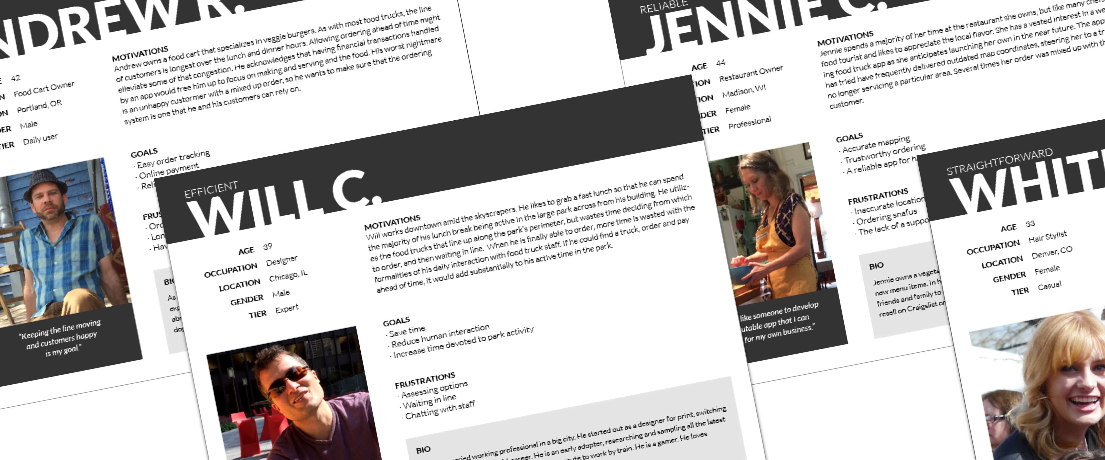
Personas
Personas for this project not only represented a variety of potential food truck customers, but food truck owners as well.
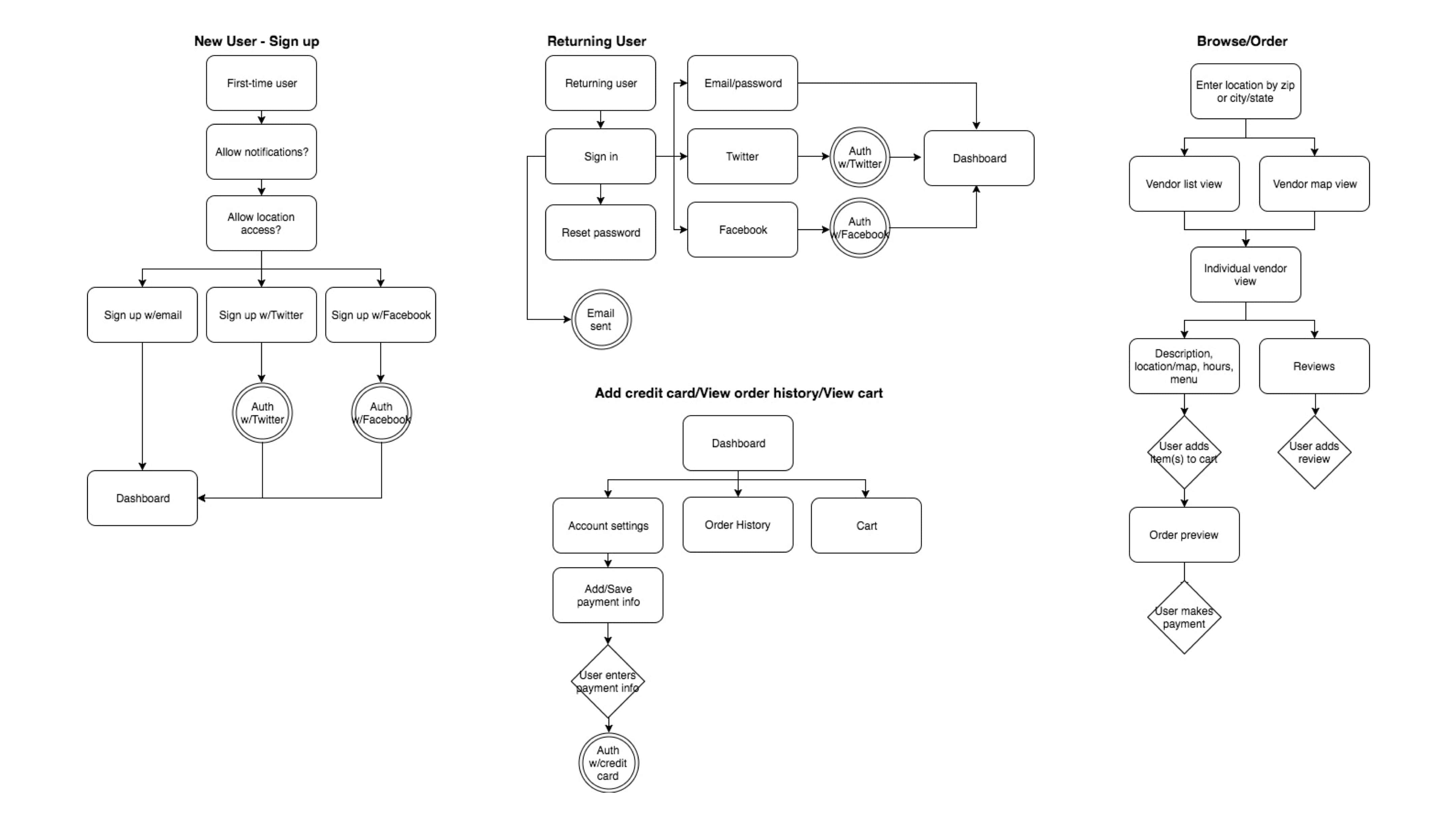
User stories + task flows
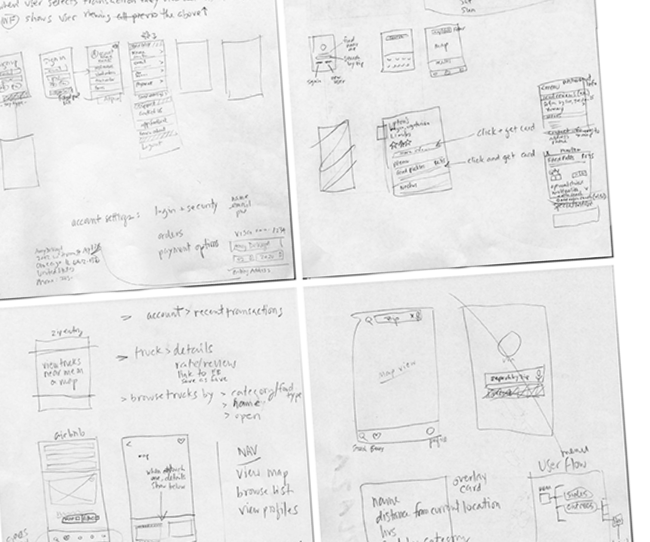
I wrote numerous user stories and some basic task flows, which I then fleshed out as Draw.io user flow diagrams that I could refer to during design, and—ostensibly—development.
Design research
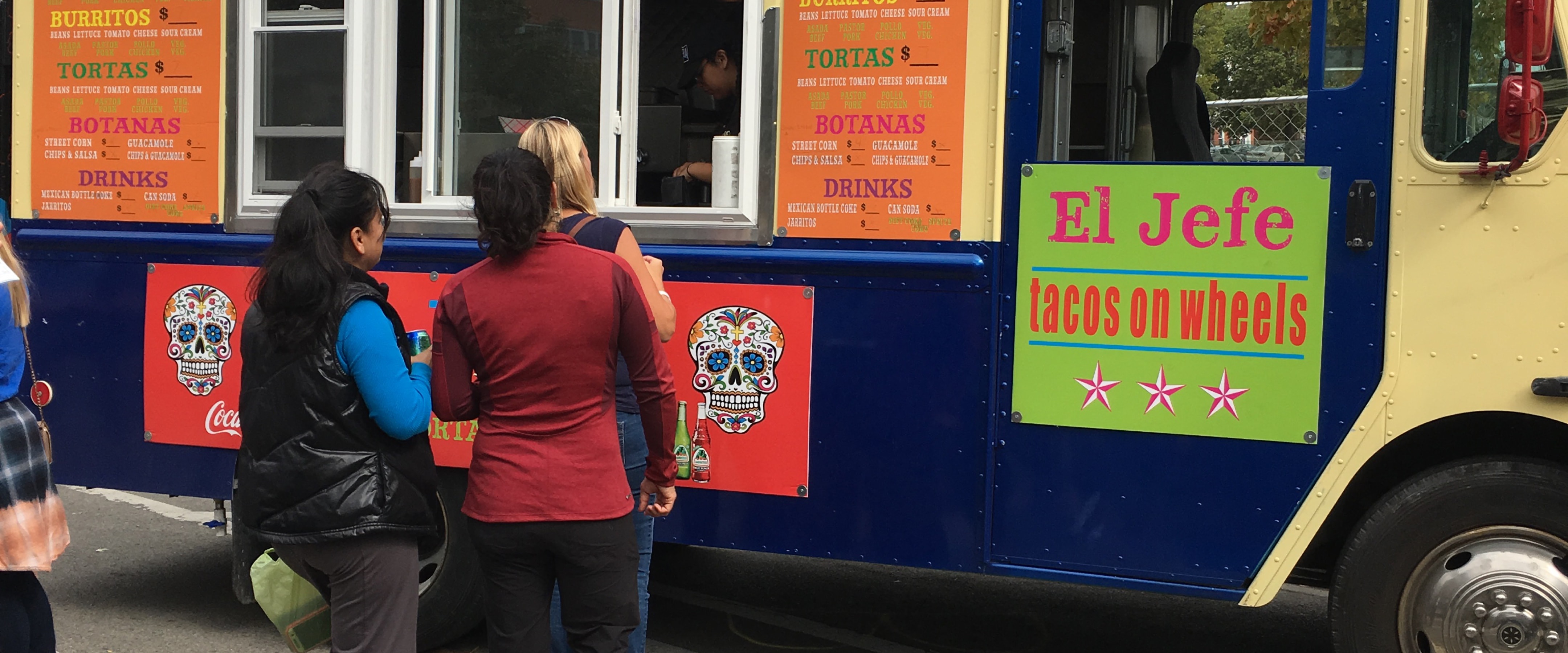
First person research included visiting food trucks around the city, as well as downloading a dozen or so existing apps and documenting the ordering processes of each to determine features, as well as what worked and what didn’t.
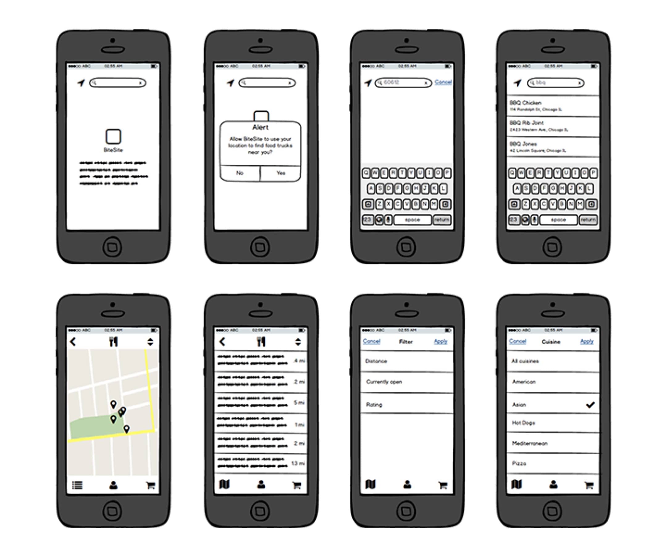
Sketches + lo-fi wireframes
I translated my design notes and user flow sketches created during the research phase into low-fidelity wireframes in Balsamiq that I used to create an Invision prototype that I could test with potential users. The results of those user tests informed multiple iterations of flow design.
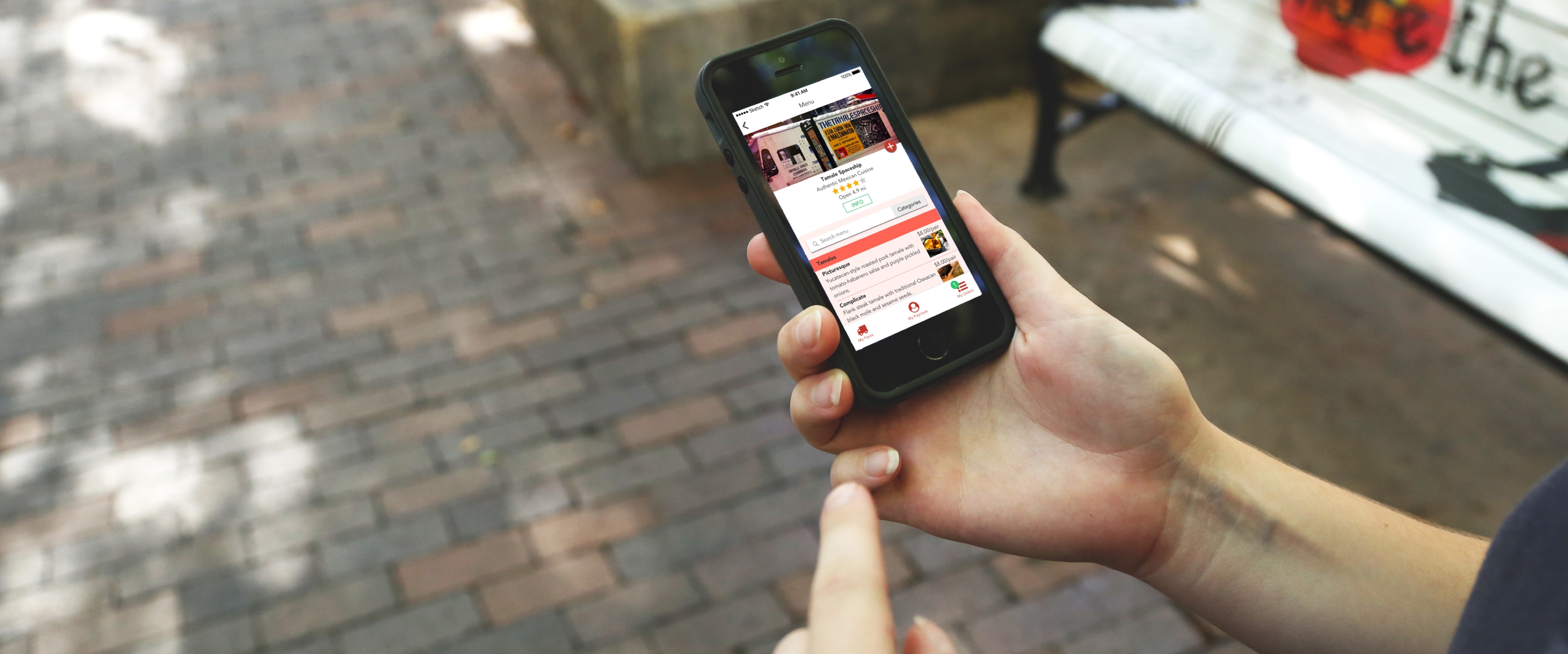
Hi-fi mockups
I designed high fidelity mockups in Sketch using the existing logo, color palette and typography specs that were provided. I studied and carefully followed Apple’s Human Interface Guidelines.
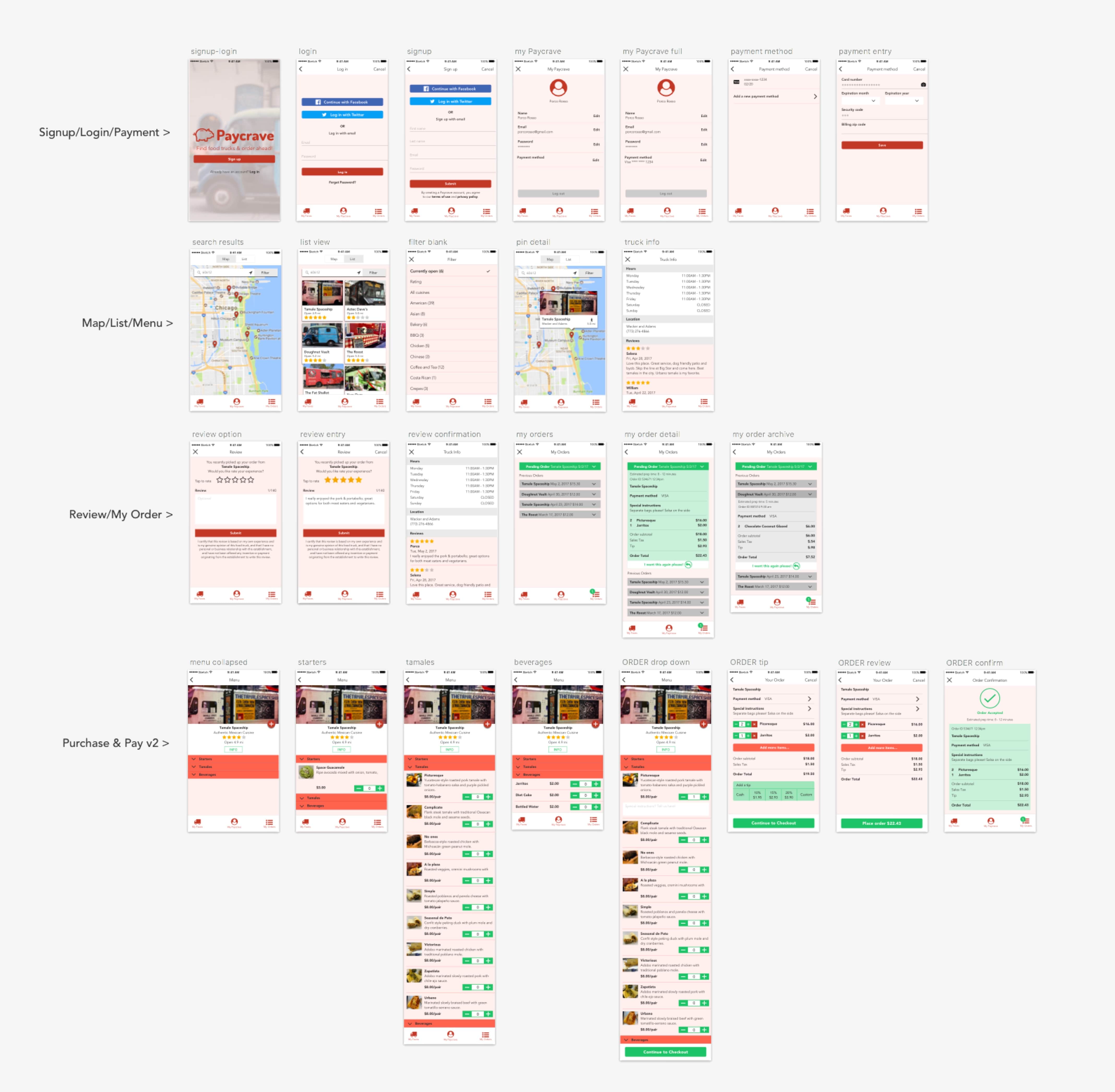
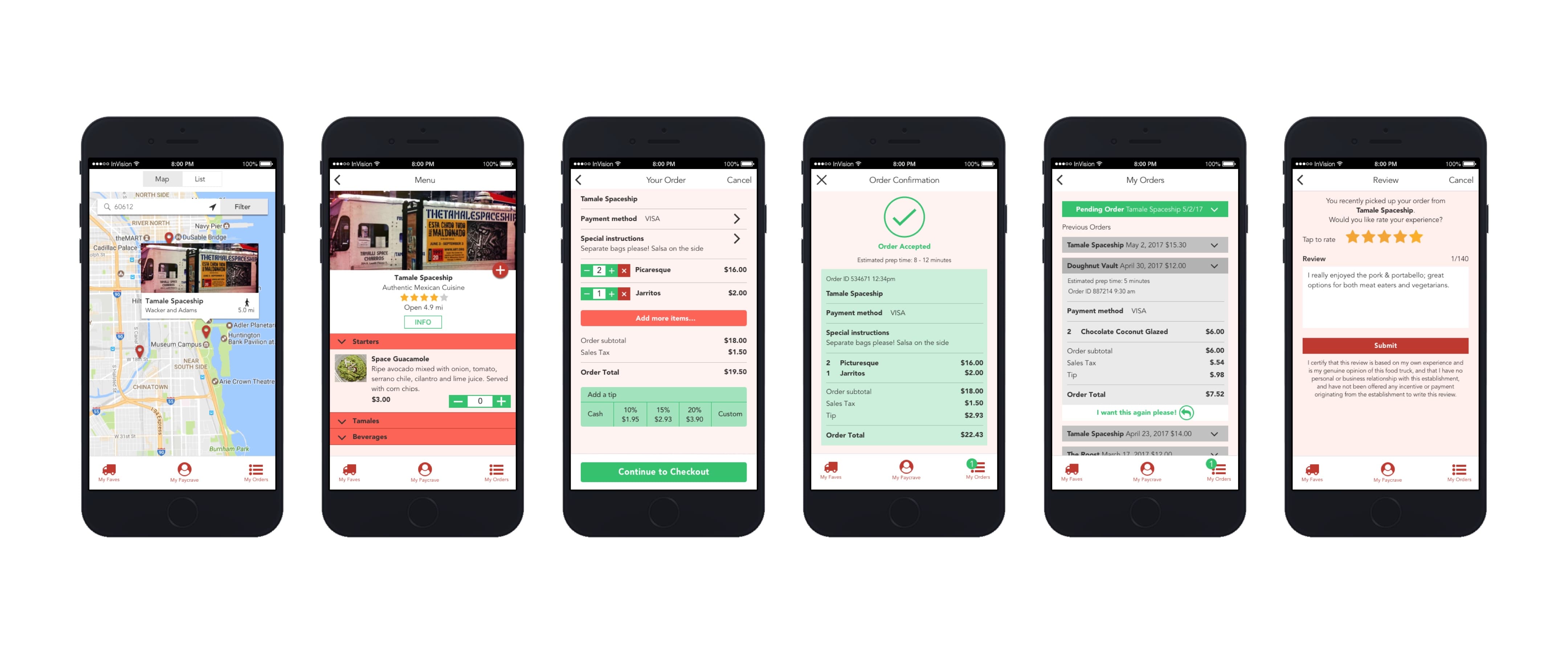
Prototype
I created a prototype using Invision that I used to survey and test potential users for feedback.
User testing
In addition to gathering feedback via Typeform and Usabilityhub surveys that I posted to Reddit and various Slack channels, I tested users in person as well. I watched as they moved through the prototype and interviewed them during the process. Several useful features came out of these conversations, such as the ability to re-order the same order, and allowing the app to alert users when their order is ready.
Conclusion
I came out of this project with a real appreciation of Apple’s iOS Human Interface Guidelines as well as Google’s Material Design system. I also realized that spontaneous feedback gathered from in-person interviews can be invaluable. Check out the prototype.